
Chapter 1 Lab 1: Graphing Data
Whoops —Edward Tufte
As we have found out from the textbook and lecture, when we measure things, we get lots of numbers. Too many. Sometimes so many your head explodes just thinking about them. One of the most helpful things you can do to begin to make sense of these numbers, is to look at them in graphical form. Unfortunately, for sight-impaired individuals, graphical summary of data is much more well-developed than other forms of summarizing data for our human senses. Some researchers are developing auditory versions of visual graphs, a process called sonification, but we aren’t prepared to demonstrate that here. Instead, we will make charts, and plots, and things to look at, rather than the numbers themselves, mainly because these are tools that are easiest to get our hands on, they are the most developed, and they work really well for visual summary. If time permits, at some point I would like to come back here and do the same things with sonification. I think that would be really, really cool!
1.1 General Goals
Our general goals for this first lab are to get your feet wet, so to speak. We’ll do these things:
- Load in some data to a statistical software program
- Talk a little bit about how the data is structured
- Make graphs of the data so we can look at it and make sense of it.
1.1.1 Important info
Data for NYC film permits was obtained from the NYC open data website. The .csv file can be found here: Film_Permits.csv
Gapminder data from the gapminder project (copied from the R gapminder library) can be downloaded in .csv format here: gapminder.csv
1.2 Excel
Have you ever gotten home (or to Brooklyn college) to find orange cones preventing you from parking because yet another film shoot has been issued a permit to take up the entire block with trucks and trailers? Today we are going to take a look at some data collected by the New York City government, about filming permits issued in the last several years.
1.2.1 Goals
Today I will walk you through techniques to make several different types of graphs in excel, that will help us quickly visually summarize a large set of data. You will learn to:
- Count occurrences of variables in cells
- Make bar graphs of this data
- Construct a histogram using the data analysis tool pack
- Write a brief interpretation of our findings
The data we will look at today contains 14 different variables of information about 50728 different film permits issued by the city in the last several years. That is a lot of data, and can be pretty intimidating at first glance. Trying to wrap our heads around any meaning of patterns in this data seems like a daunting task. This is why statistics and graphs are awesome. Statistics and graphs are short cuts that help complicated trends and patterns hidden in large sets of numbers become obvious to the human eye / brain. Before we get started, let’s load up the data, and you can see what I mean.
1.2.2 Load the data
- Download the data as a .csv file from section 1.3 above (INSERTLINK 1.3)
- Open the downloaded file in excel
- Save the file as an Excel document
File → Save As…
filetype: .xlsx
name: personalize the file name so you will recognize this as your own copy of the data (maybe: Lab1_YourName)
1.2.3 Inspect the data
When you open the Excel file, you will see many rows and columns of data. Each row (except row 1) contains data corresponding to one filming permit (what we might think of as a “subject” in this case). Row 1 however, contains the names of each variable, which we call the “Header” row. Each column contains data for a single variable, for every subject. Using the bar on the right edge of your screen, scroll through the data a bit and take a look.
I’ll wait….
Did you find anything cool in there? Notice any patterns about where, when, how long film permits are issued for?
No! Of course you didn’t! Right now our data is just a giant mess of numbers! Way too many numbers!!!
This is the fundamental reason why graphs and statistics are awesome. We are going to distill meaning that is easily and quickly identifiable out of this hot mess of numbers.
Our analysis goals for this walkthrough are:
- Create a bar graph that displays the number of permits issued in each borough.
- Create a bar graph that displays the number of each type of permit issued in Brooklyn.
- Create a histogram that displays the lengths of time that these permits are valid for.
1.2.4 Preparing the data
1.2.4.1 Creating blank worksheets
First, we will create a blank worksheet for each of the graphs we will be producing today.
- Click the “+” button on the worksheet tab bar to create a new worksheet
- Right click on the new worksheets tab and select “rename”
- Give the sheet a meaningful name, maybe “BarGraph - Borough”
- Repeat steps 1-3 until you have 3 blank worksheets, one for each graph. Rename each one with a sensible name
1.2.4.2 Create a working copy of the data
We will now copy to each of these sheets just the data we will need to complete each graph. In Excel, there are often many paths to the correct answer/graph/statistic. The method I am about to show you is very clean and organized, but as you get more experience with excel, you might find ways to take shortcuts and skip some of these steps
For each of our 3 graphs, and 3 corresponding worksheets, we will need different variables:
| Graph | Variables needed |
|---|---|
| Bar graph by Borough | Borough |
| Bar graph by type, Brooklyn only | Borough and Category |
| Histogram of permit duration | StartDateTime and EndDateTime |
- Go to the worksheet named “Film_Permits” that contains the original data by clicking its’ name on the worksheet tab bar (near the bottom of your screen)
- click on the letter “H” above the column named “Borough”. This will select the entire column of data
- Press ctrl+c to copy this data to the clipboard (or right click the data you selected and then click “copy”)
- Go to the worksheet where you will create the first bar graph.
- Click cell “A1”
- Press ctrl+v to paste this data from the clipboard (or right click “the data you selected”A1" and then click “paste”)
Repeat this process until all three of your new worksheets contain the variables mentioned in the table above.
1.2.5 Bar graph by borough
The first graph we create will be a bar graph. The (horizontal) x-axis of this graph will display each of the five boroughs. The vertical) y-axis of this graph will display the frequency, or number, of film permits issued per borough.
1.2.5.1 Calculate Values to graph
First click the tab of the worksheet where you placed only the “Borough variable” to make that sheet active.
In order to generate this graph, we first need to calculate how many permits were issued in each of the five boroughs.
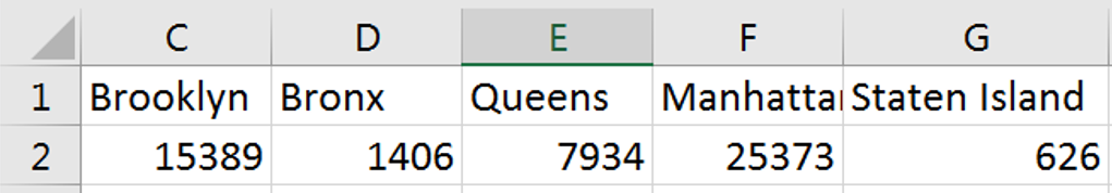
- Starting in column C, Row 1, (as in Cell C1), write the name of one of the 5 boroughs. Let’s start with “Brooklyn”, because.
- In the cell to the right of C1, aka D1, write “Bronx”.
- Keep going to the right, and write the labels “Queens”, “Manhattan”, and “Staten Island”
- In cell C2, write or copy/paste the formula:
=COUNTIF(A:A,C1)
- Press enter.
You should now see that the cell C2 now displays 15389. This is the total number of film permits issued in Brooklyn over the past several years. The “CountIf” function takes two inputs, separated by a comma. The first input tells the function “Where should I count stuff?” and the second input tells the function “What should I count there?”.
So “=COUNTIF(A:A,C1)” translates to “Search through the whole A column (A:A), and count each cell if it equals whatever is in cell C1 (Brooklyn)”.
The help files inside excel are pretty great at explaining how different functions work. you can quickly access the help file on any function by type it into a cell and clicking its name. See the video below.
- Repeat this process to under each of the four other borough labels.
You should end up with:
1.2.5.2 Create and customize the graph
Now that we have our data, we can go about making our graph.
- Press down the left mouse button on C1 (where it says “Brooklyn”) and hold drag your mouse to the right until you have highlighted all five borough names, and down until you have selected both the labels and the data.
- Release the mouse button (I’m so glad I remembered to include this step. You could have ended up holding the mouse button down forever!).
- Click the “Insert” button on the menu ribbon near the top of your screen
- Click the “column chart” button to insert a column chart.
And there we go! ’We have a bar graph!
Now let’s play with some of the graphs options to make it look a little more presentable.
- Select your graph
- Click the “Design” button on the menu ribbon
- Click “add chart element”. From this menu you can add and remove features from your graph.
- Click “Axis labels” to add labels to both your vertical and horizontal axes.
- Now your graph will have the words “Axis title” along both the bottom and left edge.
- Click into these text boxes and give the axis a sensible label (maybe “Film Permits” and “Borough”)
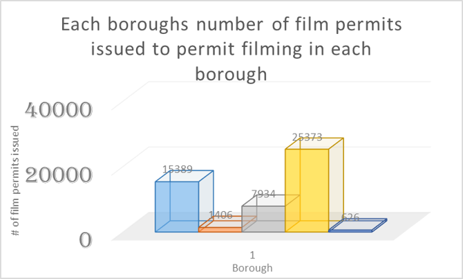
Play with the other settings and options in the design ribbon. There are a lot of options on how to present a graph. The most important thing to remember is that a graph should be as easy to read as possible. Try not to include things that are redundant, or don’t add to the point you are trying to make.
On other words, this:
Not this:
1.2.6 Bar graph by type, Brooklyn only
Now we are going to make a similar graph, but this time we are going to look at the types of permits being issued, but only in Brooklyn (leaving the other lesser boroughs out of it for now).
Because we only want to count each category in only one borough, we are going to have to use the =COUNTIFS function this time around.
1.2.6.1 Calculate Values to graph
- Click the second worksheet we created before, the one that we pasted the Borough and Category variables to.
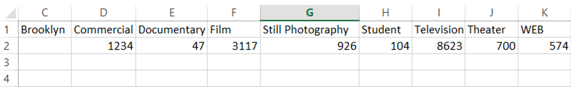
Create a label for each type of category, starting in cell D1 and moving to the right. (Commercial, Film, Still, Photography, Student, Television, Theater, WEB)
- Write “Brooklyn” in cell C1
in Cell D2, write the function:
=COUNTIFS(A:A,C1,B:B,D1)
Countifs will only count rows that meet all of its’ criteria.
Its usage is =countifs(where to count 1 , what to count 1, where to count 2, what to count 2 ).
The function we just entered translates to: Search through the borough variable (column A) and count all the rows that say “Brooklyn” (C1), then search through those rows in the category variable (column B), and count all the ones that say “Commercial” (D1)
Remember to check out the excel help on countifs.
- Repeat this function for each of the other category labels (Television, etc.)
your result should look like this:
1.2.6.2 Create and customize graph
- Highlight the data we just calculated
- Click the “Insert” button on the menu ribbon near the top of your screen
- Click the “column chart” button to insert a column chart.
Give it axis labels, and make any other design changes you think make the graph easier to read.
1.2.7 Histogram of permit duration
We will now make a histogram of the duration of each of these permits. A histogram is a lot like a bar graph, except histograms are used for continuous variables (like length of time), and bar graphs are used for categorical variables (like borough or category). The biggest visual difference is that the bars in a bar graph have space between them, while a histograms bars touch each other.
1.2.7.1 Install the data analysis toolbox
We will use the data analysis toolbox to construct this graph. The data analysis toolbox is a free add on for Microsoft excel. Most university computers will already have this installed. To check if the data analysis toolbox is installed:
- Click “data” in the menu ribbon
- if the data tab contains a section called “analysis”, and a “data analysis” button, then the toolbox is installed, and you can proceed, if not follow these instructions to install the toolbox.
1.2.7.2 Calculate Values to graph
- Click the third worksheet we created before, the one that we pasted the Start Date and End Date variables to.
- In cell C2, to the right of the first start/end date pair, type the formula:
=B2-A2
Subtracting the start data from the end date will give us the number of days the permit was issued for. a value of “.25” means that the permit was valid for 6 hours (.25 * 24 hours in a day)
Now we need to copy paste the formula into column C next to each row of data. But since this data set holds over 50,000 rows, selecting all of that data manually would be tedious. I’m going to use so keyboard shortcuts here, that make it ver easy to move around large sets of data in excel.
- Start by click the cell we want to copy (C2, where we put the subtraction formula)
- press ctrl+c to copy that formula.
- Press the left arrow once to move to cell B2
- Hold the ctrl button and press the down arrow. This will “jump” the cursor down to the end of the data. When you hold ctrl, arrow keys move the cursor to the last piece of data in that row or column, before a blank cell.
- Now release the ctrl button, and press the right arrow once, moving the highlighted cell to C50729.
- Hold ctrl+shift+up arrow. This makes the cursor jump back up to our formula, and holding shift make it highlight all cells between the start and end of the jump
- press ctrl+V to paste our formula in the cells we just selected.
Learning to use the arrow keys, ctrl, and shift to move around and highlight data in Excel can turn a 2 hour analysis into a 20 minute analysis, and is a great skill to practice. An Excel champion very rarely needs to touch their mouse.
1.2.7.3 Create and customize graph
1.2.7.3.1 Create bin labels
Now that we have the duration of each permit, we can start to put it together for use in a histogram. In order to do this, we will need to define the “bins” (x-axis units) of our histogram.
- In cell E2 type the number “0”
- Now in the cell below 0, write the formula
= E2+.1
- Copy this formula in the spaces below, until the final result = 3 (days)
1.2.7.3.2 Data analysis toolbox - Histogram
- Click the “data” button in the menu ribbon
- Click the “data analysis” button
- Select the “histogram” option
- Next to “input range”, click the cell selection button
- Using the mouse, click the label “C” at the top of the column containing the permit duration values.
- Press enter
- Next to “Bin Range”, click the cell selection button
- Using the mouse, highlight the bin values we created in step 3.
- Press enter
- Make sure the check mark next to “Chart output” is selected
- In the output section, select “New Worksheet” and enter a name (maybe “Permit Duration - Histogram”)
- Press enter
Excel will now create a new worksheet that has a frequency table, using the bins we provided, and a histogram of that data. We could have created this chart the hard way, using a =COUNTIF function, but the data analysis toolbox did a lot of the work for us in this example.
Now you can edit the visual appearance of the graph. At the very least, we need to make all the bars touch one another, to make it clear to that this is a histogram and not a bar graph.
- Right click on one of the bars of the graph and select “Format data series”
- In the window that appears, set “gap width” to 0
1.2.8 Reporting and interpreting our results
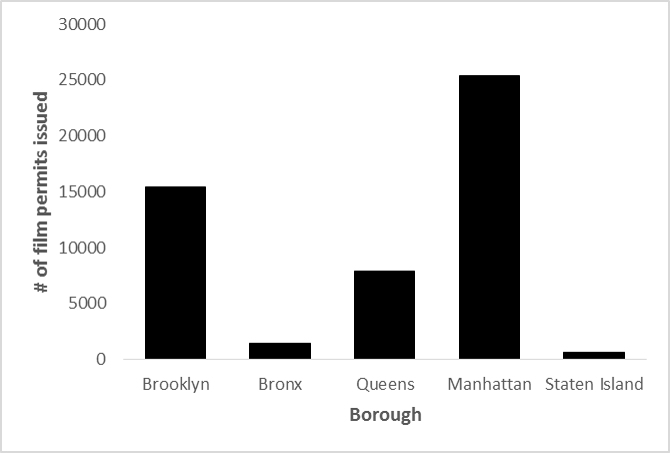
Figure 1
Figure 1 shows the number of film permits issued in each of the last 5 boroughs over the last several years. From this graph we can see that in Manhattan and Brooklyn, over 15000 permits have been issued over this period. Queens has also had a high number of permits issued, Whilre very few permits have been issued in the Bronx and Staten Island.
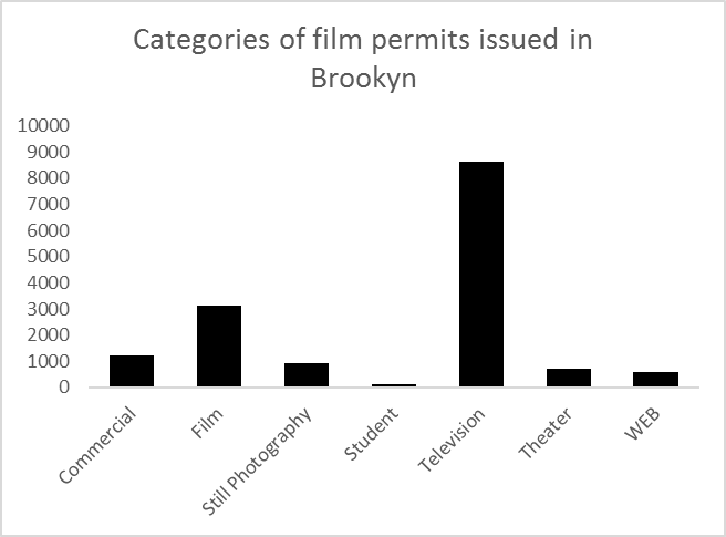
Figure 2
Figure 2 shows the number of film permits issued in Brooklyn, broken down by category of permit. Here we can see that the vast majority of filming that goes on in Brooklyn is for television projects, with film projects a distant second.
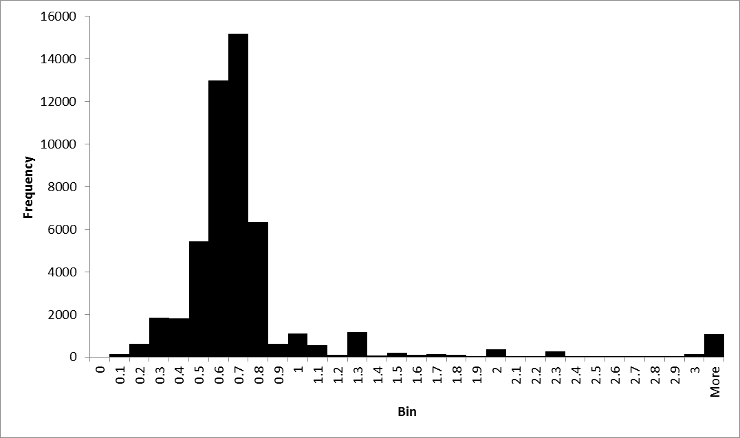
Figure 3
Figure 3 is a histogram of the duration of time that film permits issued in NYC are valid for between .6 and .7 days. This number makes sense, as that is the approximate length of an average working day. The data set contains ~ 1000 outliers, which are permits in the “more than 3 days” category.
1.2.9 On Your Own
Create a bar graph that shows the frequency of each category of film permit across all five boroughs.
Create 4 more bar graphs of the frequency of each category of film permit in each of the other four borough (beside the one we already made for Brooklyn)
Create a histogram of the time between the date a permit was entered into the NYC system (EnteredOn) and the start date of the permit (StartDateTime)
In one to two pages, discuss what you see in these graphs, and what you can learn about film permits in NYC with all the graphs you made today. Be sure to label each graph, and make specific references in your text to each of the graphs, explaining how/what that graph has to say.